Plotting spatio-temporal data with Python
Overview
Teaching: 0 min
Exercises: 0 minQuestions
How can I create maps with python?
Objectives
Learn how to plot spatio-temporal data with python.
This tutorial is based from the basemap tutorial.
What is matplotlib? Why should we learn to use it?
While python offers a large range of python packages for plotting spatio-temporal data, we will focus here on the most generic python interface to create maps. Most of other python packages used for plotting spatio-temporal data are based on matplotlib.
The main principle of matplotlib
First, matplotlib has two user interfaces:
- The first mimics MATLAB plotting and uses the pylab interface.
- The second option is an object-oriented interface which is much more powerful.
When plotting with matplotlib, it is very important to know and understand that there are two approaches even though the reasons of this dual approach is outside the scope of this lesson.
When searching for help on the internet, you will find solutions where the two approaches are mixed which may be very confusing for you. The best for new codes is to stick to the object-oriented interface and this is what we will show in this lesson.
Key Point
New matplotlib users should learn and use the object oriented interface.
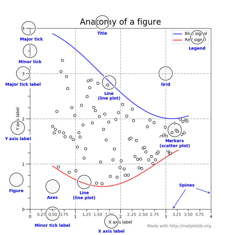
What is a Figure and an Axes?
The main idea with object-oriented programming is to have objects that one can apply functions and actions on, and no object or program states should be global (such as the MATLAB-like API). The real advantage of this approach becomes apparent when more than one figure is created, or when a figure contains more than one subplot as we will see in this tutorial.
To use the object-oriented API we need to create a new figure instance and store it in a variable; we call this variable fig but you can choose any name.
Actually this is what we will need to do when we create more than one figure!
A figure can contain several plots (also called sub-plots) so the first thing to do is to choose how many sub-plots your figure will contain. This is done
with the add_subplot method of an object of type figure:
%matplotlib inline
import matplotlib.pyplot as plt
fig = plt.figure()  # a new figure window
ax = fig.add_subplot(1, 1, 1)  # specify (nrows, ncols, axnum)
The resulting figure is:

Here we created one subplot and one axes only. We will give another example afterwards to explain the arguments of the function add_subplot in more details.
Then we use the ax object to customize our subplot and finally plot data. For instance, we can add:
- a title to our subplot
- a title for x-axis and y-axis
- ticks at chosen location for x-axis and y-axis
%matplotlib inline
import matplotlib.pyplot as plt
import numpy as np

fig = plt.figure()  # a new figure window
ax = fig.add_subplot(1, 1, 1)  # specify (nrows, ncols, axnum)
ax.set_title('Title of my subplot', fontsize=14)

# set tick labels for x-axis
ax.set_xticklabels(np.arange(10), rotation=45, fontsize=10 )
# set a title for x-axis
ax.set_xlabel("title for x-axis")
# choose where and how many ticks on the x-axes
ax.set_xticks(np.arange(0, 10, 1.0))


# set tick labels for y-axis
ax.set_yticklabels(np.arange(5), rotation=45, fontsize=10 )
# set a title for y-axis
ax.set_ylabel("title for y-axis")
# choose where and how many ticks on the y-axes
ax.set_yticks(np.arange(0, 5, 1.0))

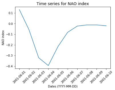
Simple plots - Timeseries
Our goal is to plot a timeserie for North Atlantic Oscillation (NAO) index. We take first sample data i.e. NAO indices for 10 days only from the 1st of June 2001 to the 10th of June 2001:
import datetime
dates = [datetime.date( 2001,6,1),
     datetime.date( 2001,6,2),
     datetime.date( 2001,6,3),
     datetime.date( 2001,6,4),
     datetime.date( 2001,6,5),
     datetime.date( 2001,6,6),
     datetime.date( 2001,6,7),
     datetime.date( 2001,6,8),
     datetime.date( 2001,6,9),
     datetime.date( 2001,6,10)]
# NAO index for each date
nao_index = [ 0.132, -0.058, -0.321, -0.395, -0.216, -0.082, -0.023, -0.012, -0.012, -0.02]
Then we plot with matplotlib:
%matplotlib inline
import matplotlib.pyplot as plt
fig = plt.figure()  # a new figure window
ax = fig.add_subplot(1, 1, 1)  # specify (nrows, ncols, axnum)
# set a title for this sub-plot
ax.set_title('Time series for NAO index', fontsize=14)
# set tick for x-axis
ax.set_xticks(dates)
# set labels for x-ticks (dates) and rotate them (45 degrees) for readability
ax.set_xticklabels(dates, rotation=45, fontsize=10 )
# set a title for x-axis
ax.set_xlabel("Dates (YYYY-MM-DD)")
# set a title for y-axis
ax.set_ylabel("NAO index")
# plot nao_index as a function of dates.
ax.plot(dates, nao_index)
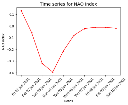
date formatting
You can fully control how your dates appear in your plot:
import matplotlib.pyplot as plt
import matplotlib.dates
%matplotlib inline
fig = plt.figure()  # a new figure window
ax = fig.add_subplot(1, 1, 1)  # specify (nrows, ncols, axnum)
# set a title for this sub-plot
ax.set_title('Time series for NAO index', fontsize=14)
# set tick for x-axis
ax.set_xticks(dates)
# set labels for x-ticks (dates) and rotate them (45 degrees) for readability
ax.set_xticklabels(dates, rotation=45, fontsize=10 )
# set a title for x-axis
ax.set_xlabel("Dates")
# set a title for y-axis
ax.set_ylabel("NAO index")

ax.xaxis.set_major_formatter(
    matplotlib.dates.DateFormatter('%a %d %b %Y')
 )
# plot nao_index as a function of dates.
ax.plot(dates, nao_index, 'r.-')
DateFormatter: use strftime() format strings
What is basemap?
Basemap is an extension of matplotlib; one of the most common plotting library for Python. You may have heard or will hear about other python packages for
plotting spatio-temporal data (for instance pandas, geopandas, pynio & pyngl, pyqgis, plotly, bokeh, cartopy, iris, scikit-learn, seaborn, etc.); many of them
are using matplotlib/basemap underneath for plotting and are data specific. We think it is important to understand matplotlib/basemap and learn how to use
it effectively in your scientific workflow. At the end of the workshop, we will talk about other packages to visualize your data and we hope that this lesson
will make it easier.
Create simple maps with basemap
As explained in lesson Intro to Coordinate Reference Systems & Spatial Projections, the projection you choose for plotting your maps is very important and depends on what you want to visualize and over which region of the globe.
Plotting raster and vector data with basemap
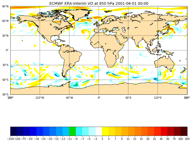
plotting raster data
In our first example, we wish to plot the Vorticity fields from ECMWF ERA-Interim reanalysis
for summer 2001 (June, July and August). ECMWF ERA-Interim is a global atmospheric reanalysis from 1979, continuously updated in real time and this dataset is
freely available. However, you would need to register
to fully access their public dataset. If you wish to download your own set of data in python (various parameters and dates)
you can install the python package called ECMWF WEB-API.
This part is out of scope of this tutorial and we provide a sample data set in netCDF format EI_VO_Summer2001.nc.
Inspect
EI_VO_Summer2001.nc(check metadata):import netCDF4 f = Dataset("EI_VO_Summer2001.nc", "r") print(f) f.close()What can you say about this file?
Solution
netcdf EI_VO {
dimensions:
	lon = 512 ;
	lat = 256 ;
	lev = 1 ;
	time = UNLIMITED ; // (368 currently)
variables:
	double lon(lon) ;
		lon:standard_name = "longitude" ;
		lon:long_name = "longitude" ;
		lon:units = "degrees_east" ;
		lon:axis = "X" ;
	double lat(lat) ;
		lat:standard_name = "latitude" ;
		lat:long_name = "latitude" ;
		lat:units = "degrees_north" ;
		lat:axis = "Y" ;
	double lev(lev) ;
		lev:standard_name = "air_pressure" ;
		lev:long_name = "pressure" ;
		lev:units = "Pa" ;
		lev:positive = "down" ;
		lev:axis = "Z" ;
	double time(time) ;
		time:standard_name = "time" ;
		time:units = "hours since 2001-6-1 00:00:00" ;
		time:calendar = "proleptic_gregorian" ;
		time:axis = "T" ;
	float VO(time, lev, lat, lon) ;
		VO:standard_name = "atmosphere_relative_vorticity" ;
		VO:long_name = "Vorticity (relative)" ;
		VO:units = "s**-1" ;
		VO:code = 138 ;
		VO:table = 128 ;
		VO:grid_type = "gaussian" ;

// global attributes:
		:CDI = "Climate Data Interface version 1.7.0 (http://mpimet.mpg.de/cdi)" ;
		:Conventions = "CF-1.4" ;
		:history = "Thu Feb 04 14:28:54 2016: cdo -t ecmwf -f nc copy EI_VO.grb EI_VO.nc" ;
		:institution = "European Centre for Medium-Range Weather Forecasts" ;
		:CDO = "Climate Data Operators version 1.7.0 (http://mpimet.mpg.de/cdo)" ;
}
This file contains one variable only called Vorticity (relative), in s**-1, stored on a lat/lon gaussian grid for one level only and 368 times (UNLIMITED dimension which means we can potentialy add more times).
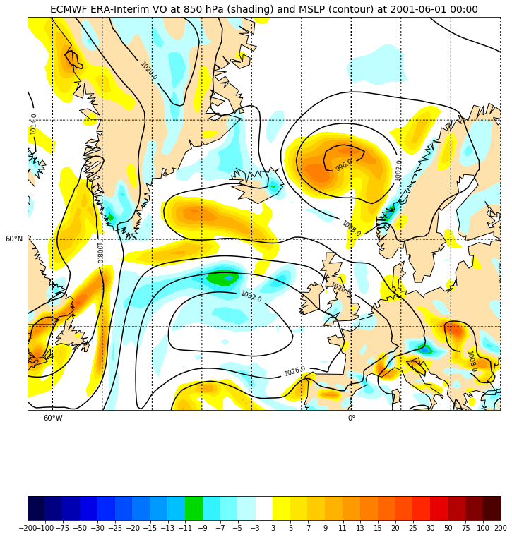
Let’s plot it on a world map:
%matplotlib inline
import matplotlib.pyplot as plt
from matplotlib import colors as c
from mpl_toolkits.basemap import Basemap, shiftgrid

import numpy as np
import netCDF4
f = netCDF4.Dataset('EI_VO_850hPa_Summer2001.nc', 'r')
lats = f.variables['lat'][:]
lons = f.variables['lon'][:]
 # read first time and unique level and scale it to the right units
VO = f.variables['VO'][0,0,:,:]*100000
fig = plt.figure(figsize=[12,15])  # a new figure window
ax = fig.add_subplot(1, 1, 1)  # specify (nrows, ncols, axnum)
ax.set_title('ECMWF ERA-Interim VO at 850 hPa 2001-06-01 00:00', fontsize=14)

map = Basemap(projection='cyl',llcrnrlat=-90,urcrnrlat=90,\
            llcrnrlon=-180,urcrnrlon=180,resolution='c', ax=ax)

map.drawcoastlines()
map.fillcontinents(color='#ffe2ab')
# draw parallels and meridians.
map.drawparallels(np.arange(-90.,120.,30.),labels=[1,0,0,0])
map.drawmeridians(np.arange(-180.,180.,60.),labels=[0,0,0,1])

# shift data so lons go from -180 to 180 instead of 0 to 360.
VO,lons = shiftgrid(180.,VO,lons,start=False)
llons, llats = np.meshgrid(lons, lats)
x,y = map(llons,llats)
# make a color map of fixed colors
cmap = c.ListedColormap(['#00004c','#000080','#0000b3','#0000e6','#0026ff','#004cff',
                         '#0073ff','#0099ff','#00c0ff','#00d900','#33f3ff','#73ffff','#c0ffff',
                         (0,0,0,0),
                         '#ffff00','#ffe600','#ffcc00','#ffb300','#ff9900','#ff8000','#ff6600',
                         '#ff4c00','#ff2600','#e60000','#b30000','#800000','#4c0000'])
bounds=[-200,-100,-75,-50,-30,-25,-20,-15,-13,-11,-9,-7,-5,-3,3,5,7,9,11,13,15,20,25,30,50,75,100,200]
norm = c.BoundaryNorm(bounds, ncolors=cmap.N) # cmap.N gives the number of colors of your palette

cs = map.contourf(x,y,VO, cmap=cmap, norm=norm, levels=bounds,shading='interp')
#
#
## make a color bar
fig.colorbar(cs, cmap=cmap, norm=norm, boundaries=bounds, ticks=bounds, ax=ax, orientation='horizontal')
f.close()
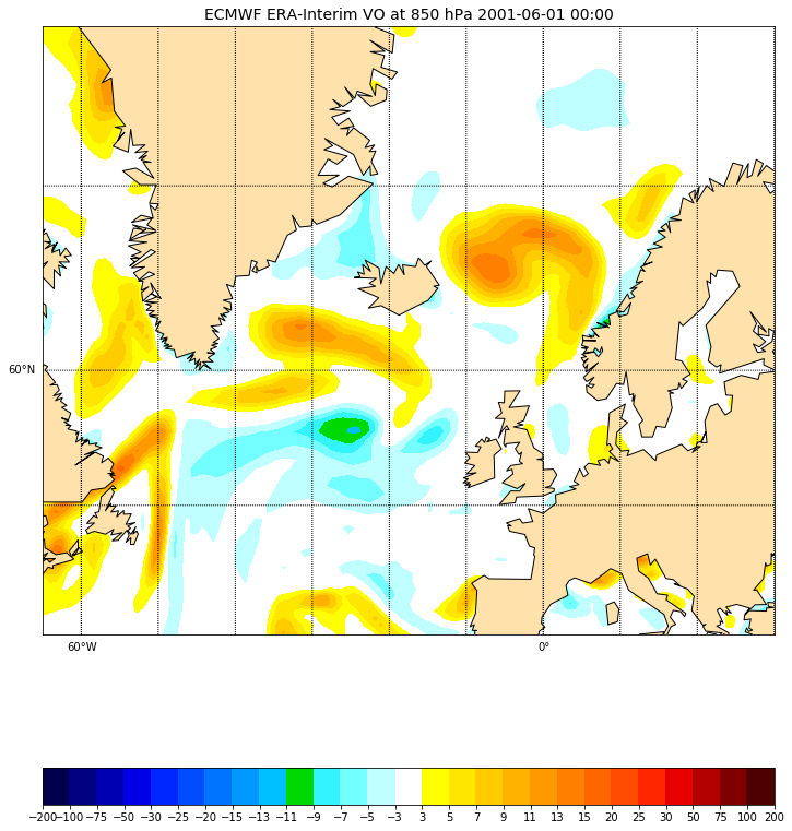
And to zoom over a user-defined area:
%matplotlib inline
import matplotlib.pyplot as plt
from matplotlib import colors as c
from mpl_toolkits.basemap import Basemap, shiftgrid

import numpy as np
import netCDF4
f = netCDF4.Dataset('EI_VO_850hPa_Summer2001.nc', 'r')
lats = f.variables['lat'][:]
lons = f.variables['lon'][:]
VO = f.variables['VO'][0,0,:,:]*100000  # read first time and unique level
fig = plt.figure(figsize=[12,15])  # a new figure window
ax = fig.add_subplot(1, 1, 1)  # specify (nrows, ncols, axnum)
ax.set_title('ECMWF ERA-Interim VO at 850 hPa 2001-06-01 00:00', fontsize=14)

map = Basemap(projection='merc',llcrnrlat=38,urcrnrlat=76,\
            llcrnrlon=-65,urcrnrlon=30, resolution='c', ax=ax)
map.drawcoastlines()
map.fillcontinents(color='#ffe2ab')
# draw parallels and meridians.
map.drawparallels(np.arange(-90.,91.,20.))
map.drawmeridians(np.arange(-180.,181.,10.))
map.drawparallels(np.arange(-90.,120.,30.),labels=[1,0,0,0])
map.drawmeridians(np.arange(-180.,180.,60.),labels=[0,0,0,1])

# shift data so lons go from -180 to 180 instead of 0 to 360.
VO,lons = shiftgrid(180.,VO,lons,start=False)
llons, llats = np.meshgrid(lons, lats)
x,y = map(llons,llats)
# make a color map of fixed colors
cmap = c.ListedColormap(['#00004c','#000080','#0000b3','#0000e6','#0026ff','#004cff',
                         '#0073ff','#0099ff','#00c0ff','#00d900','#33f3ff','#73ffff','#c0ffff',
                         (0,0,0,0),
                         '#ffff00','#ffe600','#ffcc00','#ffb300','#ff9900','#ff8000','#ff6600',
                         '#ff4c00','#ff2600','#e60000','#b30000','#800000','#4c0000'])
bounds=[-200,-100,-75,-50,-30,-25,-20,-15,-13,-11,-9,-7,-5,-3,3,5,7,9,11,13,15,20,25,30,50,75,100,200]
norm = c.BoundaryNorm(bounds, ncolors=cmap.N) # cmap.N gives the number of colors of your palette

cs = map.contourf(x,y,VO, cmap=cmap, norm=norm, levels=bounds,shading='interp')
#
#
## make a color bar
fig.colorbar(cs, cmap=cmap, norm=norm, boundaries=bounds, ticks=bounds, ax=ax, orientation='horizontal')
f.close()
Overlay another field
We can read another field “Mean Sea level pressure” and overlay it on top of the preceding plot:
# Add another field on top of the existing VO contours.

f = netCDF4.Dataset('EI_mslp_Summer2001.nc', 'r')
lats = f.variables['lat'][:]
lons = f.variables['lon'][:]
mslp = f.variables['MSL'][0,:,:]/100.0  # mean sea level pressure i.e. surface field.
# shift data so lons go from -180 to 180 instead of 0 to 360.
mslp,lons = shiftgrid(180.,mslp,lons,start=False)
llons, llats = np.meshgrid(lons, lats)
x,y = map(llons,llats)
cs = map.contour(x,y,mslp, zorder=2, colors='black')
ax.clabel(cs, fmt='%.1f',fontsize=9, inline=1)
f.close()
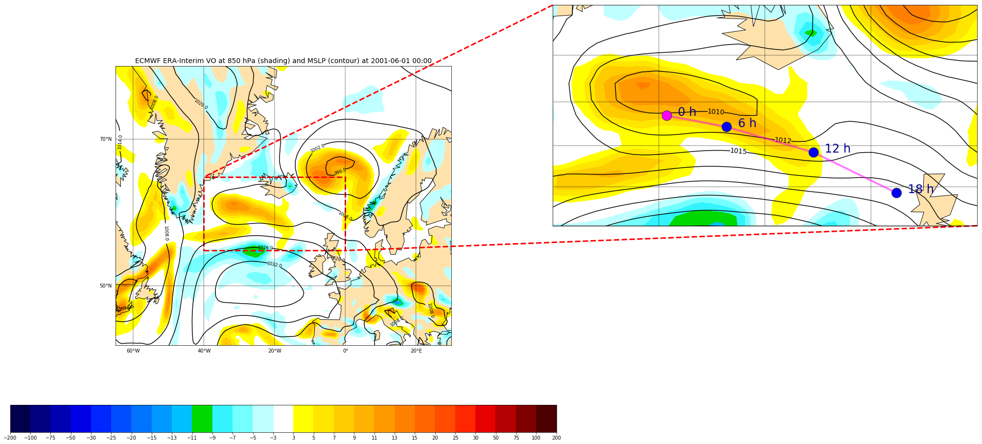
Inset locators
We will zoom on a chosen area on our map and plot this additional map on the top right of our figure. The location of the zoomed box can be specified with an integer value:
# Add a rectangle and zoom
# Inset locators
from mpl_toolkits.axes_grid1.inset_locator import zoomed_inset_axes
from mpl_toolkits.axes_grid1.inset_locator import mark_inset
import numpy.ma as ma

# Sub-region where we zoom (3x)
llat=56
ulat=66
llon=-40
rlon=0

# 3 indicates the zoom ratio; loc=1 --> upper right
axins = zoomed_inset_axes(ax, 3, loc=1, bbox_to_anchor=(1.5, 1.0),
                 bbox_transform=ax.figure.transFigure)
- ‘upper right’ : 1,
- ‘upper left’ : 2,
- ‘lower left’ : 3,
- ‘lower right’ : 4,
- ‘right’ : 5,
- ‘center left’ : 6,
- ‘center right’ : 7,
- ‘lower center’ : 8,
- ‘upper center’ : 9,
- ‘center’ : 10
Then we can make the same plot as before but for the zoomed area:
map.drawcoastlines(ax=axins)
map.fillcontinents(color='#ffe2ab', zorder=0, ax=axins)
# draw parallels and meridians.
# labels = [left,right,top,bottom]
map.drawparallels(np.arange(-90.,120.,2.),labels=[0,0,0,0], ax=axins)
map.drawmeridians(np.arange(-180.,180.,10.),labels=[0,0,0,0], ax=axins)

# sub region of the original image

x1,y1 = map(llon, llat)
x2,y2 = map(rlon,ulat)
axins.set_xlim(x1, x2)
axins.set_ylim(y1, y2)
csins = map.contourf(x,y,VO, cmap=cmap, norm=norm, levels=bounds,shading='interp', zorder=1, ax=axins)
# Add another field on top of the existing VO contours.

# set the maximum number of contour to 20
csins = map.contour(x,y,mslp,20,zorder=2, colors='black', ax=axins)
axins.clabel(csins, fontsize=14, inline=1,fmt = '%1.0f')
We can also mark our zoomed area in the original plot:
axes = mark_inset(ax, axins, loc1=2, loc2=4,
        edgecolor='red', # line color
        linestyle='dashed',
        linewidth=3)

Challenge
We would like to add another plot on top of the previous figure in the zoomed area. The file
tracks_20010601.csvcontains storm tracks stored as a list of locations (longitude, latitude) and associated date/time.
- Add these locations using
scatterorplotmethods and label each point with its corresponding time (0h, 6h, 12h, 18h).datetime,lon,lat 2001-06-01 00:00:00,-29.241394,61.386189 2001-06-01 06:00:00,-23.598511,60.872208 2001-06-01 12:00:00,-15.4021,59.676353 2001-06-01 18:00:00,-7.580597,57.688072This file can be read with the
pandaspython package:# To read track data, use pandas library import pandas data = pandas.read_csv('tracks_20010601.csv') print(data)Solution
# Insert track data - we use pandas library
import pandas

data = pandas.read_csv('tracks_20010601.csv')
print(data)
xt, yt = map(np.array(data['lon']), np.array(data['lat']))
cols = ['blue' for i in range(xt.size)]
cols[0]='magenta'

# make a black line
map.plot(xt,yt, '-', color='magenta', zorder=9, ax=axins, alpha=0.5, linewidth=4)
# plot each individual point with the first point with a different color
map.scatter(xt, yt, s=20**2, color=cols,edgecolor='#333333', zorder=10, ax=axins)
# Annotate each point with its date and time
for i, lpoint in enumerate(pandas.to_datetime(data["datetime"])):
   axins.annotate(' {0:d} h'.format(lpoint.hour), (xt[i],yt[i]),
               xytext=(15,0), textcoords='offset points',
               fontsize=24, color='darkblue')
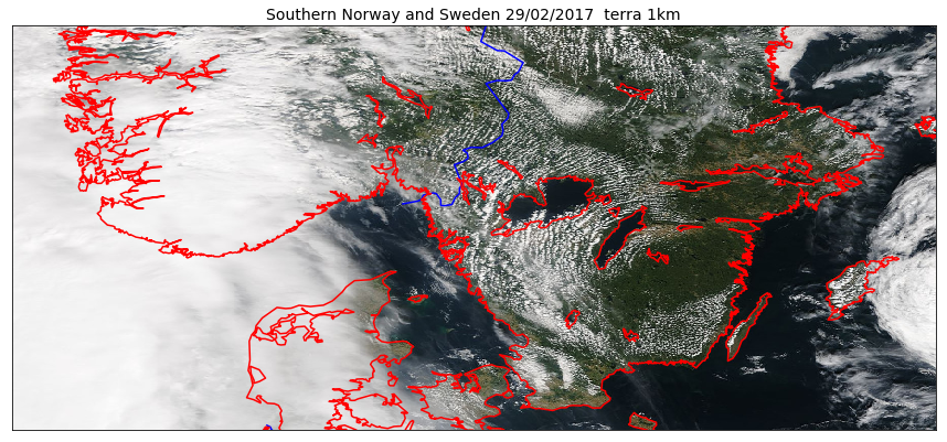
Overlay GeoTIFF
A simple way to plot a GeoTIFF image and eventually overlay additional field/information is to use the same projection as the GeoTIFF file:
%matplotlib inline
import matplotlib.pyplot as plt
from mpl_toolkits.basemap import Basemap
from osgeo import gdal
import numpy as np
fig = plt.figure(figsize=(15,15)) # a new figure window
ax = fig.add_subplot(1, 1, 1) # specify (nrows, ncols, axnum)
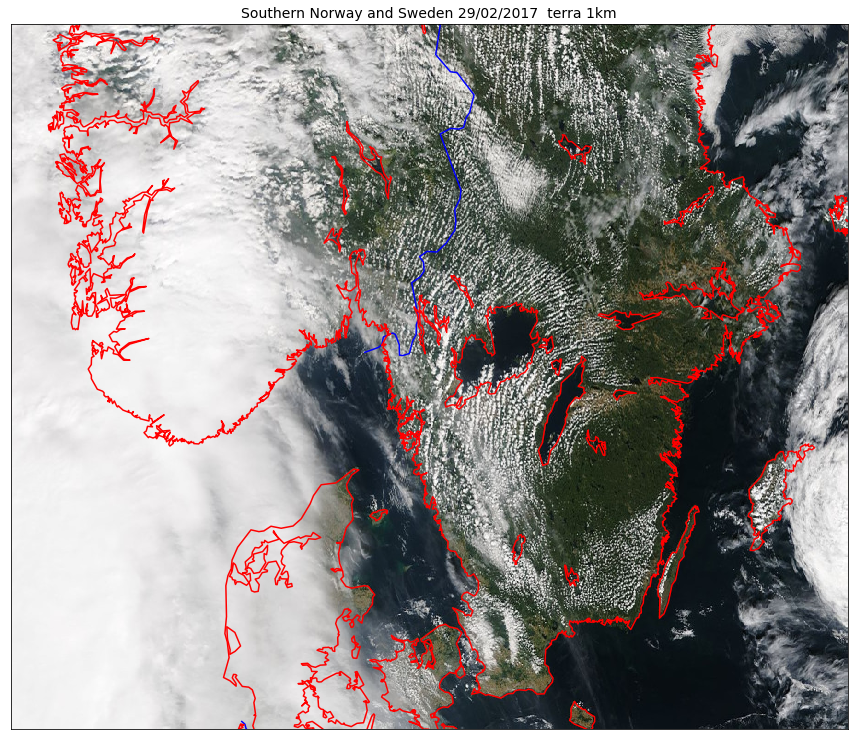
ax.set_title('Southern Norway and Sweden 29/02/2017 terra 1km', fontsize=14)
# Read the data and metadata
datafile = gdal.Open(r'Southern_Norway_and_Sweden.2017229.terra.1km.tif')
bnd1 = datafile.GetRasterBand(1).ReadAsArray()
bnd2 = datafile.GetRasterBand(2).ReadAsArray()
bnd3 = datafile.GetRasterBand(3).ReadAsArray()
nx = datafile.RasterXSize # Raster xsize
ny = datafile.RasterYSize # Raster ysize
img = np.dstack((bnd1, bnd2, bnd3))
gt = datafile.GetGeoTransform()
proj = datafile.GetProjection()
print("Geotransform",gt)
print("proj=", proj)
xres = gt[1]
yres = gt[5]
# get the edge coordinates and add half the resolution
# to go to center coordinates
xmin = gt[0] + xres * 0.5
xmax = gt[0] + (xres * nx) - xres * 0.5
ymin = gt[3] + (yres * ny) + yres * 0.5
ymax = gt[3] - yres * 0.5
print("xmin=", xmin,"xmax=", xmax,"ymin=",ymin, "ymax=", ymax)
map = Basemap(projection='cyl',llcrnrlat=ymin,urcrnrlat=ymax,\
llcrnrlon=xmin,urcrnrlon=xmax , resolution='i', ax=ax)
map.imshow(img, origin='upper', ax=ax)
map.drawcountries(color='blue', linewidth=1.5, ax=ax)
map.drawcoastlines(linewidth=1.5, color='red', ax=ax)
And if we would like to use pcolormesh instead of imshow:
%matplotlib inline
import matplotlib.pyplot as plt
from mpl_toolkits.basemap import Basemap
from osgeo import gdal
import numpy as np

fig = plt.figure(figsize=(15,15))  # a new figure window
ax = fig.add_subplot(1, 1, 1)  # specify (nrows, ncols, axnum)
ax.set_title('Southern Norway and Sweden 29/02/2017  terra 1km', fontsize=14)

# Read the data and metadata
datafile = gdal.Open(r'Southern_Norway_and_Sweden.2017229.terra.1km.tif')
bnd1 = datafile.GetRasterBand(1).ReadAsArray()
nx = datafile.RasterXSize # Raster xsize
ny = datafile.RasterYSize # Raster ysize

gt = datafile.GetGeoTransform()
proj = datafile.GetProjection()

print("Geotransform",gt)
print("proj=", proj)
xres = gt[1]
yres = gt[5]


# get the edge coordinates and add half the resolution
# to go to center coordinates
xmin = gt[0] + xres * 0.5
xmax = gt[0] + (xres * nx) - xres * 0.5
ymin = gt[3] + (yres * ny) + yres * 0.5
ymax = gt[3] - yres * 0.5
print("xmin=", xmin,"xmax=", xmax,"ymin=",ymin, "ymax=", ymax)

# create a grid of lat/lon coordinates in the original projection
(lon_source,lat_source) = np.mgrid[xmin:xmax+xres:xres, ymax+yres:ymin:yres]
print(xmin,xmax+xres,xres, ymax+yres,ymin,yres)


map = Basemap(projection='cyl',llcrnrlat=ymin,urcrnrlat=ymax,\
            llcrnrlon=xmin,urcrnrlon=xmax , resolution='i', ax=ax)
# project in the original Basemap and olot with pcolormesh

map.pcolormesh(lon_source,lat_source,bnd1.T, cmap='bone')
map.drawcountries(color='blue', linewidth=1.5, ax=ax)
map.drawcoastlines(linewidth=1.5, color='red', ax=ax)
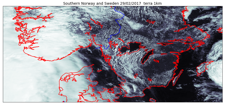
As we can see on the figure above, using the projection of the GeoTIFF file is not always a good approach. To choose a better projection, we need to convert the coordinates taking the projection of our raster (here GeoTIFF) as the source and the projection defined in our Basemap object as the target coordinate system.
%matplotlib inline
import matplotlib.pyplot as plt
from mpl_toolkits.basemap import Basemap
from osgeo import gdal
import numpy as np

fig = plt.figure(figsize=(15,15))  # a new figure window
ax = fig.add_subplot(1, 1, 1)  # specify (nrows, ncols, axnum)
ax.set_title('Southern Norway and Sweden 29/02/2017  terra 1km', fontsize=14)

# Read the data and metadata
datafile = gdal.Open(r'Southern_Norway_and_Sweden.2017229.terra.1km.tif')
bnd1 = datafile.GetRasterBand(1).ReadAsArray()
bnd2 = datafile.GetRasterBand(2).ReadAsArray()
bnd3 = datafile.GetRasterBand(3).ReadAsArray()
nx = datafile.RasterXSize # Raster xsize
ny = datafile.RasterYSize # Raster ysize

rgb = np.dstack((bnd1/bnd1.max(), bnd2/bnd2.max(), bnd3/bnd3.max()))
color_tuple = rgb.transpose((1,0,2)).reshape((rgb.shape[0]*rgb.shape[1],rgb.shape[2]))
gt = datafile.GetGeoTransform()
proj = datafile.GetProjection()

print("Geotransform",gt)
print("proj=", proj)
xres = gt[1]
yres = gt[5]


# get the edge coordinates and add half the resolution
# to go to center coordinates
xmin = gt[0] + xres * 0.5
xmax = gt[0] + (xres * nx) - xres * 0.5
ymin = gt[3] + (yres * ny) + yres * 0.5
ymax = gt[3] - yres * 0.5
print("xmin=", xmin,"xmax=", xmax,"ymin=",ymin, "ymax=", ymax)

# create a grid of lat/lon coordinates in the original projection
(lon_source,lat_source) = np.mgrid[xmin:xmax+xres:xres, ymax+yres:ymin:yres]
print(xmin,xmax+xres,xres, ymax+yres,ymin,yres)

map = Basemap(projection='merc',llcrnrlat=ymin,urcrnrlat=ymax,\
            llcrnrlon=xmin,urcrnrlon=xmax , resolution='i', ax=ax)
# project in the original Basemap

x,y = map(lon_source, lat_source)
print("shape lon and lat_source: ", lon_source.shape, lat_source.shape,bnd1.T.shape)
map.pcolormesh(x,y,bnd1.T,color=color_tuple)
map.drawcountries(color='blue', linewidth=1.5, ax=ax)
map.drawcoastlines(linewidth=1.5, color='red', ax=ax)
Remark
You can use the Pandas library to do read a wide range of data formats (including netCDF) and for instance to do statistics.
- Pandas is a widely-used Python library for statistics, particularly on tabular data.
- Borrows many features from R’s dataframes: * A 2-dimenstional table whose columns have names and potentially have different data types.
- In our preceding example, we used it to load
tracks_20010601.csv- Read a Comma Separate Values (CSV) data file with
pandas.read_csv. * Argument is the name of the file to be read. * Assign result to a variable to store the data that was read. For more on pandas, see the Software Carpentry lesson Plotting and Programming in Python.
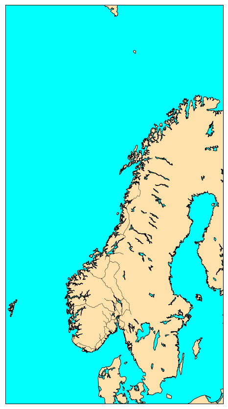
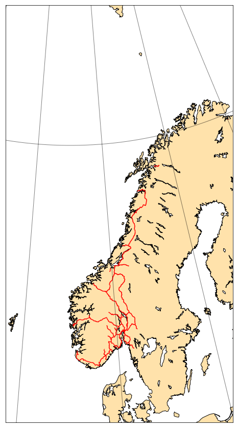
Plotting vector data (shapefile)
We will see how to visualize GeoJSON file in our last chapter when publishing on the web. Here we learn how to plot shapefile data only.
Shapefiles can be complex to visualize depending on what type of shapefile (points, lines, etc.). However, matplotlib has a very simple way to handle shapefiles with lines or polygons. Let’s take back an example from our chapter on data formats.
%matplotlib inline
from mpl_toolkits.basemap import Basemap
import matplotlib.pyplot as plt
fig = plt.figure(figsize=[12,15]) # a new figure window
ax = fig.add_subplot(1, 1, 1) # specify (nrows, ncols, axnum)
map = Basemap(llcrnrlon=-1.0,urcrnrlon=40.,llcrnrlat=55.,urcrnrlat=75.,
resolution='i', projection='lcc', lat_1=65., lon_0=5.)
map.drawmapboundary(fill_color='aqua')
map.fillcontinents(color='#ffe2ab',lake_color='aqua')
map.drawcoastlines()
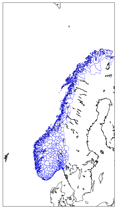
norway_roads= map.readshapefile('Norway_railways/railways', 'railways')
plt.show()
We had nothing to do but reading the shapefile with readshapefile method from a Basemap object. The first argument is the shapefile name
with its full path (but without .shp file extension) and the second argument is the name (to be found in the file). You can customize your plot,
for instance, by specifying the color and line width:
norway_roads= map.readshapefile('Norway_railways/railways', 'railways', color='red',linewidth=1.5)
Often, this approach is not flexible enough…
Let’s take an example:
%matplotlib inline
from mpl_toolkits.basemap import Basemap
import matplotlib.pyplot as plt

fig = plt.figure(figsize=[12,15])  # a new figure window
ax = fig.add_subplot(1, 1, 1)      # specify (nrows, ncols, axnum)

map = Basemap(llcrnrlon=-1.0,urcrnrlon=40.,llcrnrlat=55.,urcrnrlat=75.,
              resolution='i', projection='lcc', lat_1=65., lon_0=5.)

map.drawmapboundary(fill_color='white')
map.fillcontinents(color='#ffe2ab', zorder=0, ax=ax)
map.drawcoastlines()

norway_natural= map.readshapefile('NOR_adm/NOR_adm', 'NOR_adm', color='blue',  drawbounds=True)

plt.show()
Source: http://www.diva-gis.org/gdata
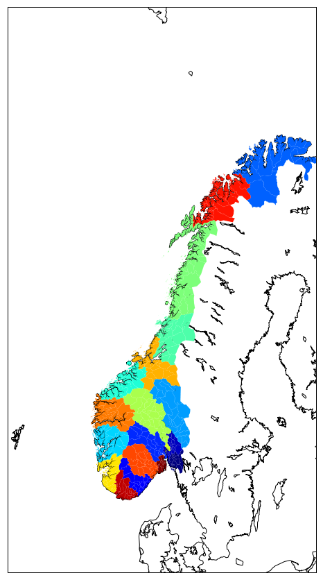
For instance, if we wish to fill polygons with different colors depending on the county, we can go through our shapefile and choose the
color for each county. In our shapefile NOR_adm county can be identified by their names (NAME_1) or their associated identifier (ID_1):
from osgeo import ogr

shapedata = ogr.Open('NOR_adm')
nblayer = shapedata.GetLayerCount()
print("Number of layers: ", nblayer)
layer = shapedata.GetLayer()

nor_adm = []
for i in range(layer.GetFeatureCount()):
    feature = layer.GetFeature(i)
    name_1 = feature.GetField("NAME_1")
    id_1 = feature.GetField("ID_1")
    geometry = feature.GetGeometryRef()
    nor_adm.append([i,name_1,id_1, geometry.GetGeometryName(), geometry.Centroid().ExportToWkt()])

for i in range(0,len(nor_adm),20):
    print(nor_adm[i])
Now we can assign a color for each county and make a plot where ploygons are filled according to the county name:
from mpl_toolkits.basemap import Basemap
import matplotlib.pyplot as plt
from matplotlib.patches import Polygon
from matplotlib.collections import PatchCollection
from matplotlib.patches import PathPatch
import numpy as np

fig     = plt.figure(figsize=[12,15])
ax      = fig.add_subplot(111)

map = Basemap(llcrnrlon=-1.0,urcrnrlon=40.,llcrnrlat=55.,urcrnrlat=75.,
              resolution='i', projection='lcc', lat_1=65., lon_0=5.)

map.drawmapboundary(fill_color='white')
map.fillcontinents(color='#ffe2ab', zorder=0, ax=ax)
map.drawcoastlines()

map.readshapefile('NOR_adm/NOR_adm', 'NOR_adm', drawbounds = False)

patches   = []

color_values = np.zeros(len(map.NOR_adm))
for i, info, shape in zip(range(len(map.NOR_adm_info)),map.NOR_adm_info, map.NOR_adm):
        patches.append( Polygon(np.array(shape), True) )
        color_values[i] = info['ID_1']

col = PatchCollection(patches, linewidths=1., zorder=2)
col.set(array=color_values, cmap='jet')

ax.add_collection(col)

or using gal ogr:
%matplotlib inline
from mpl_toolkits.basemap import Basemap
import matplotlib.pyplot as plt
from matplotlib.patches import Polygon
from matplotlib.collections import PatchCollection
from matplotlib.patches import PathPatch
import numpy as np

fig     = plt.figure(figsize=[12,15])
ax      = fig.add_subplot(111)


map = Basemap(llcrnrlon=-1.0,urcrnrlon=40.,llcrnrlat=55.,urcrnrlat=75.,
              resolution='i', projection='lcc', lat_1=65., lon_0=5.)

map.drawmapboundary(fill_color='white')
map.fillcontinents(color='#ffe2ab', zorder=0, ax=ax)
map.drawcoastlines()

shapedata = ogr.Open('NOR_adm')
nblayer = shapedata.GetLayerCount()
print("Number of layers: ", nblayer)
layer = shapedata.GetLayer()
patches = []
color_values = np.empty((0), int)
for i in range(layer.GetFeatureCount()):
    feature = layer.GetFeature(i)
    name_1 = feature.GetField("NAME_1")
    id_1 = feature.GetField("ID_1")
    geometry = feature.GetGeometryRef()

    nbrRings = geometry.GetGeometryCount()
    type_geom = geometry.GetGeometryName()
    if  type_geom == "MULTIPOLYGON":
	# get outer ring of each polygon
        for geom_part in geometry:
            lon,lat=zip(*(geom_part.GetGeometryRef(0).GetPoints()))
            x,y = map(lon,lat)
            patches.append( Polygon(np.array(list(zip(x,y))), True) )
            color_values = np.append(color_values, id_1)
    else:
    # get outer ring only 0 (not interested by holes)
	# get points from this first ring
        lon,lat=zip(*(geometry.GetGeometryRef(0).GetPoints()))
        x,y = map(lon,lat)
        patches.append( Polygon(np.array(list(zip(x,y))), True) )
        color_values = np.append(color_values, id_1)

col = PatchCollection(patches, linewidths=1., zorder=2)
col.set(array=color_values, cmap='jet')
ax.add_collection(col)
Save your plots
When using a jupyter notebook, it is easy to save your figures:
- right click with your mouse and save your figure as png file.
However, when running a python script or when you have many figures to generate and save, the best is to use savefig:
fig.savefig('fig.png')
To change the format, simply change the extension like so:
fig.savefig('fig.pdf')
Optimize your scientific workflow: isolate computations and plotting
If you need to perform “heavy” computations prior to plotting, it is a good idea to separate the computational part from the plotting part and for instance, create separate python scripts for the data processing part and plotting. The best to save information from the computation scripts to pass it to the plotting script is to use “standard” formats, either text files or netCDF, HDF, GEO-TIFF or shapefiles for storing spatio-temporal data. The advantage of doing this is that it is easier to tweak the plotting script without re-running the computation every time.
Summary
- Keep in mind the graphic below from the matplotlib faq to remember the terminology of a matplotlib plot i.e. what is a Figure and an Axes.
- Always use the object-oriented interface. Get in the habit of using it from the start of your analysis.
- For some inspiration, check out the matplotlib example gallery which includes the source code required to generate each example.
- Get colornames from matplotlib here.
Key Points
matplotlib and basemap