Interactive research
Overview
Teaching: 15 min
Exercises: 30 minQuestions
How to use jupyter dashboards for our research project?
Objectives
Understand how to add interactivity with jupyter dashboards and widgets
Storyline
Laura has just started her PhD program as part of the Land-Atmosphere Interaction in Cold Environments (LATICE) project at University of Oslo, Department of Geosciences, Norway. She is interested in exploring field data from the Finse Research Centre. Finse Alpine Research Center is located in the northwestern part of the Hardangervidda mountain plateau and is of great interest for scientists in particular biologists, geologists, geophysicists.
In addition to field data from Finse Research Centre, Laura wishes to use data from other Weather Stations available freely available from the Norwegian Meteorological Institute. She would need to clearly identify in her plots the data sources (Meteorological Institute or Finse Research Stations).
A large variety of data is therefore available to her and Laura would like to create the different plots to better understand her project and show what Finse Research Centre is about:
- Stream web camera from Finse railway station and show images taken from the Finse Research Centre
- Create a map to locate Weather Stations available from the Finse Alpine Research Centre and the Norwegian Meteorological Institute in the “Finse” region (Finse region at large)
- Allow users to select the station (each station has a unique identifier), variable to plot (temperature, wind direction, wind speed, relative humidity, pressure, etc.) and period of time (start date and end date)
- Create an interactive table containing information about the Weather stations
- Show information on the battery of all Finse Research Stations because measurements are not reliable when the sensor battery is low. This will allow Laura to monitor the status of each stations (when the battery is down, she cannot receive data).
To complement this work Laura would like to use a snow and land surface model to run single-point simulations (for each station location). The model she will be using is called SNOWPACK and is a multi-purpose snow and land-surface model.
SNOWPACK has originally been developed to support avalanche warning (Lehning et al., 1999)1 and thus features a very detailed description of snow properties including weak layer characterization (Stoessel et al., 2009)2, phase changes and water transport in snow (Hirashima et al., 2010)3.
In terms of computational resources, this model is not too demanding and her work will consist in:
- Compiling and create snowpack executable: SNOWPACK is a written in C++ and the main program is call
snowpack - Prepare input files necessary to run SNOWPACK for various period of time using METEOIO, a C++ library aiming at making data access easy and safe for numerical simulations in environmental sciences requiring general meteorological data
- Configure the model and run it for each weather locations
Goal
The main goal of this exercise is to write a blog/paper using Jupyter dashboards. Thanks to this approach Laura will have all the information she needs and would like to share in one single place:
- the paper storyline including her bibliography
- all the plots/visualization/video, etc.
- the SNOWPACK and METEOIO library (compiled and ready to use)
- the scientific workflows she used so that she or anyone interested in her work can easily reproduce her work (plots, simulation, etc.)
- be able to generate various output formats depending where and how she would like to publish her work (for instance slides for conferences, HTML, LaTeX, etc.)
Stream web camera / show static images
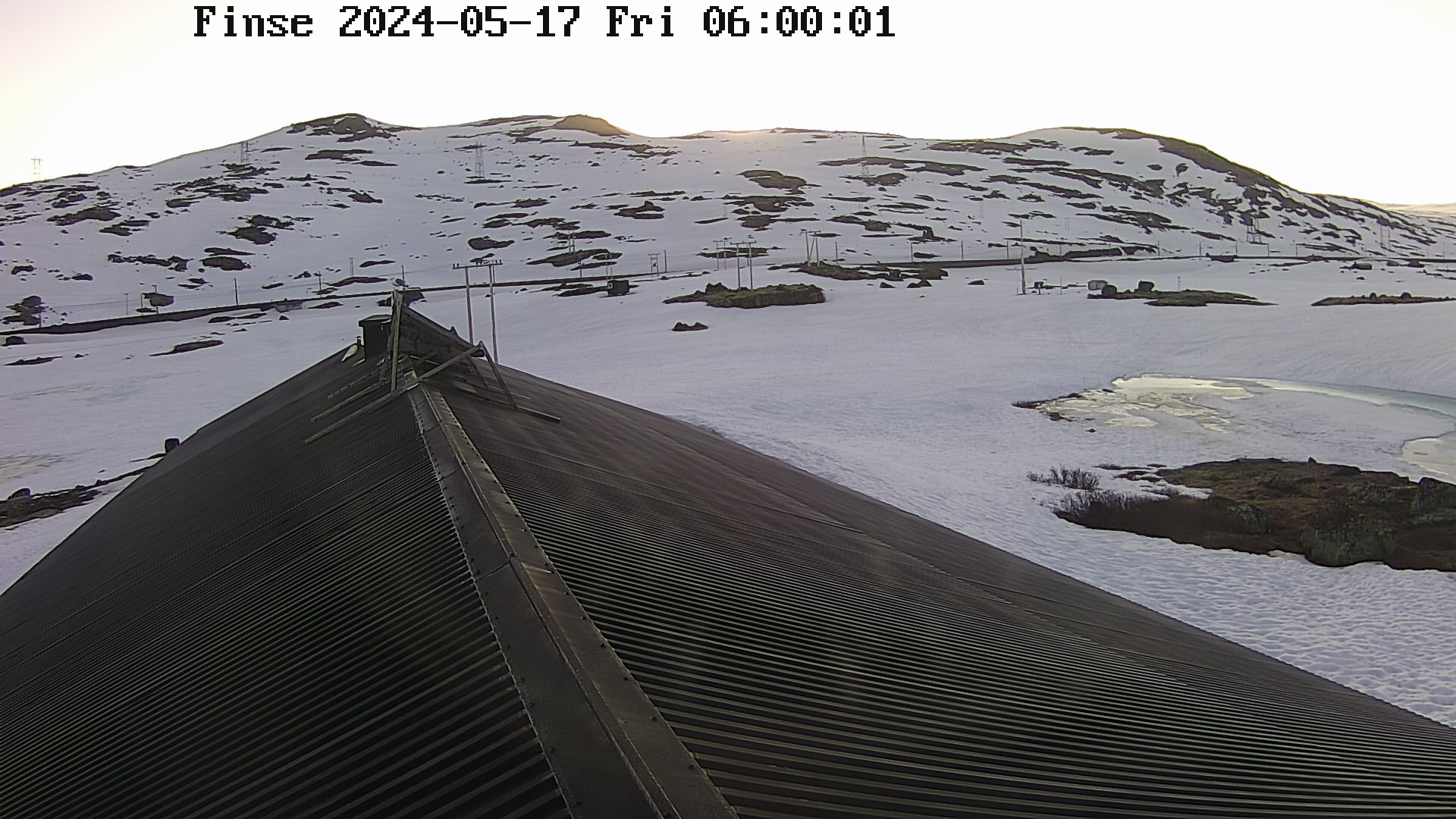
Laura can get live images from Finse railway station and there is also a webcam on the roof of Finse Research Centre (updated every hour between 6am and 6pm). The main purpose of the camera is to make it possible for researchers to follow the snow melt-off in the spring.
Laura needs to:
- Display the last available image from Finse Research Centre
- Livestream Finse railway station
Since we are viewing our jupyter notebook in a web browser, we can also render HTML content directly in the notebook. In fact, you can return virtually anything:
- image
- audio
- video
First create a new jupyter dashboard and rename it dashboard_finse.ipynb.
from IPython.display import HTML


HTML('<iframe width="560"  height="315" src="http://www.finse.uio.no/news/webcam/dagens.jpg"></iframe>')

Source: http://www.finse.uio.no/news/webcam
A string is passed within HTML and you need to use HTML (Hyper Text Markup Language) syntax. HTML is the standard markup language for creating Web pages and an in-depth description of this language is out of scope now.
And here we use iframe HTML tag. An iframe is used to display a web page within a web page and this is what we do here as we display the entire webpage http://www.finse.uio.no/news/webcam/dagens.jpg.
We also added the size (width and height) of our webpage (size we want to have in our jupyter notebook).
For more information on how to include webpage in HTML using ifram tag, look here.
Stream web camera
We apply the very same recipe to display the livestream camera from Finse Railway station:
from IPython.display import HTML
HTML('<iframe width="560"  height="315" src="http://www.bt.no/tv/embed/?id=100521" allowfullscreen="true"></iframe>')
Here we display the entire webpage http://www.bt.no/tv/embed/?id=100521.
Select camera with python interactive widget
Laura does not want to display both webcam images at the same time and would like users to be able to choose which one to display. Therefore we need to interact with our notebook and be able to choose between:
- Finse Research Centre webcams
- Finse Railway Station livestream
Let’s use python interactive widgets. To make use of Selection widgets, we need to import ipywidgets python package in our notebook.
import ipywidgets as widgets
Use your sticky note
Use a green sticky note to signal that you have successfully installed this package or the red sticky note if you encountered any problems.
Now let’s try different Selection widgets:
select = widgets.Select(
    options=['Finse Railway Station', 'Finse Research Centre'],
    value='Finse Research Centre',
    rows=2,
    description='Webcam:',
    disabled=False
)

display(select)
radio = widgets.RadioButtons(
    options=['Finse Railway Station', 'Finse Research Centre'],
    value='Finse Research Centre',
    description='Webcam:',
    disabled=False
)

display(radio)
How to display several widgets in the same cell
We used
displayto show our widget. You can pass more than one widget to display all of them in the same cell:select = widgets.Select( options=['Finse Railway Station', 'Finse Research Centre'], value='Finse Research Centre', rows=2, description='Webcam:', disabled=False ) radio = widgets.RadioButtons( options=['Finse Railway Station', 'Finse Research Centre'], value='Finse Research Centre', description='Webcam:', disabled=False ) display(select, radio)
Many more types of “Selection widgets” can be used. Have a look at the documentation to get more information.
Laura is quite happy with Radiobuttons. Now we need to display the proper webcam when a user select Finse Railway station or Finse Research Centre. The easiest way to do it is to define another widget to display HTML and to link the radiobutton widget with the HTML widget.
Let’s first see how to define an HTML widget:
webcam = widgets.HTML(
    value='<iframe width="560"  height="315" src="http://www.finse.uio.no/news/webcam/finsebilder/2018-01-26_12-00.jpg"></iframe>',
    description='Finse Research Centre', style = {'description_width': 'initial'}
)

display(webcam)
In value, you need to pass HTML code, same as we did before.
To handle changes, widgets have a method (function) called observe which can be used to register a callback function.
A callback function is a function which is:
- passed as an argument to another function, and,
- is invoked after some kind of event.
Remember our widget button. When calling its method observe, we would like to call another function handle_button_change. This function will modify the value of our second widget webcam depending on the value of the widget button:
button = widgets.RadioButtons(
    options=['Finse Railway Station', 'Finse Research Centre'],
    value='Finse Research Centre',
    description='Webcam:',
    disabled=False
)

webcam = widgets.HTML(
    value='<iframe width="560"  height="315" src="http://www.finse.uio.no/news/webcam/dagens.jpg"></iframe>',
)

def handle_button_change(change):
    if change['new'] == 'Finse Research Centre':
        webcam.value = '<iframe width="560"  height="315" src="http://www.finse.uio.no/news/webcam/dagens.jpg"></iframe>'
    else:
        webcam.value = '<iframe id="iframe" width="560"  height="315" src="http://www.bt.no/tv/embed/?id=100521" allowfullscreen="true"></iframe>'

button.observe(handle_button_change, names='value')

display(webcam, button)
The name of the callback handle_button_change is arbitrary and can be changed but the same name needs to be passed to observe method of button widget.
From jupyter notebook to jupyter dashboard
Let’s first add a title to our jupyter notebook. There are different ways to do; for instance:
- change the cell type to Markdown
- Create HTML text
Add a title
- Create a new cell above our widgets cell
- Change its type to Mardown
- Add a title
Finse Data monitoring Dashboard
Let’s do it by display HTML:
from IPython.display import HTML
HTML('<h1>Finse Data monitoring Dashboard</h1>')
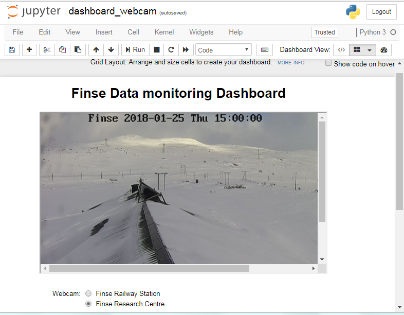
Now go to the dashboard View and click on dashboard Authoring View as shown on the figure below:
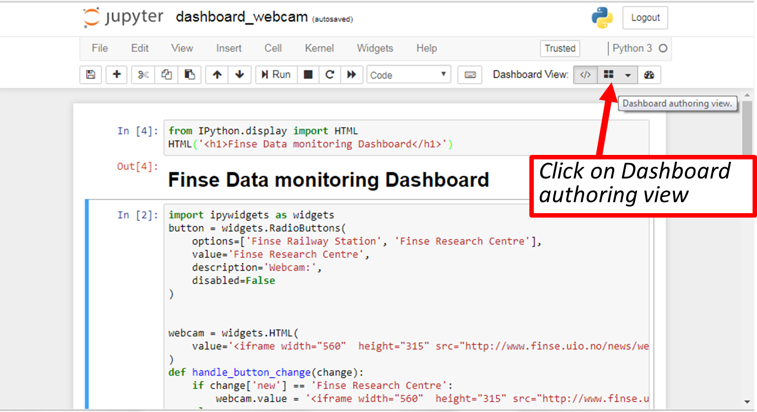
Move your cells to get your title at the top and in the middle and display webcams below. Save your dashboard and close it (Close and Halt). Reopen it and check your dashboard layout has been restored properly (you need to execute each cell and then select dashboard view).
When selecting dashboard view the code “disappears” and you should see the cell outputs only. You also have a button at the top right Show code on hover which you can activate or not to show the code.
At the bottom of your dashboard, you should see Hidden Cells. We are not using them rigth now but the idea is to have the possibility to hide the output of some cells; for instance, cells we can use to compute intermediate results but are not useful to be displayed.
Use your green sticky note when ready or red sticky note if you have any problems.
Create an interactive map for plotting geospatial data
Requirements
We need to use the following python packages:
import folium
Display Finse Research Centre stations
The locations as well as other metadata (sensor name, sensor identifier, description, etc.) of all Finse Research Centre stations are stored in https://raw.githubusercontent.com/annefou/jupyter_dashboards/gh-pages/data/Hardangervidda.geojson in geojson format. A full description of GEOJSON is out of scope now but let’s have a look at the content of our file:
{
  "type": "FeatureCollection",
  "features": [
    {
      "type": "Feature",
      "geometry": {
        "type": "Point",
        "coordinates": [7.485141, 60.571146]
      },
      "properties": {
        "name": "Sensor-1",
        "description": "Appelsinhytta",
        "country.etc": "NO",
        "waspmote_id": "023D67057C105474"
      }
    },
    {
      "type": "Feature",
      "geometry": {
        "type": "Point",
        "coordinates": [7.490383, 60.581501]
      },
      "properties": {
        "name": "Sensor-2",
        "description": "Hills",
        "country.etc": "NO",
        "waspmote_id": "1F566F057C105487"
      }
    },
    {
      "type": "Feature",
      "geometry": {
        "type": "Point",
        "coordinates": [7.502778, 60.576852]
      },
      "properties": {
        "name": "Sensor-3",
        "description": "Middaselvi discharge",
        "country.etc": "NO",
        "waspmote_id": "3F7C67057C105419"
      }
    },
    {
      "type": "Feature",
      "geometry": {
        "type": "Point",
        "coordinates": [7.503957, 60.616694]
      },
      "properties": {
        "name": "Sensor-4",
        "description": "Finselvi discharge",
        "country.etc": "NO",
        "waspmote_id": "40516F057C105437"
      }
    },
    {
      "type": "Feature",
      "geometry": {
        "type": "Point",
        "coordinates": [7.490383, 60.581501]
      },
      "properties": {
        "name": "Sensor-5",
        "description": "Hills",
        "country.etc": "NO",
        "waspmote_id": "667767057C10548E"
      }
    },
    {
      "type": "Feature",
      "geometry": {
        "type": "Point",
        "coordinates": [7.528482, 60.593514]
      },
      "properties": {
        "name": "Sensor-6",
        "description": "Drift lower lidar",
        "country.etc": "NO",
        "waspmote_id": "6D4467057C1054DC"
      }
    }
  ]
}
How to make the same plot as we have at the beginning of the lesson?
To create a geographical map, simply pass your starting coordinates to Folium:
map = folium.Map(location=[60.6, 7.5], zoom_start=11, tiles='Stamen Terrain')
The first argument of the location is the latitude (in degrees and between -90 to 90) and the second argument is the longitude (in degrees and between -180 and 180). We centered our map around the Finse area.
To display the map in your jupyter notebook:
map
Now we need to add our GEOjson file https://embed.github.com/view/geojson/annefou/jupyter_dashboards/gh-pages/data/Hardangervidda.geojson.
You can pass a GEOJSON file to folium but we first need to download it locally from here:
import urllib.request

url='https://raw.githubusercontent.com/annefou/jupyter_dashboards/gh-pages/data/Hardangervidda.geojson'
# Download the file from `url`, save it in a temporary directory and get the
# path to it (e.g. '/tmp/tmpb48zma.txt') in the `file_name` variable:
geojson_filename, headers = urllib.request.urlretrieve(url)
print(geojson_filename)
We used urllib python package and store Hardangervidda.geojson to a temporary file; the filename of this temporary file is saved in a variable we called geojson_filename.
We are now ready to read our GEOJSON file with folium and plot it:
geojson = folium.GeoJson(
    geojson_filename,
    name='geojson'
).add_to(map)

map
Create an interactive table (beakerx)
Let’s use the same json object (called geojson) we just read from our GEOJSON file.
from pandas.io.json import json_normalize
from beakerx import *

features = geojson.data['features']
json_normalize(features)
Manipulate your interactive table
- Sort by
properties.description- Hide columns
geometry.typeandtype
Create an interactive table (qgrid)
beakerx is a powerful python package and can be used for plotting too. However, it may be an overkill for interactive table.
qgrid is a much lighter python package and it renders pandas DataFrames within a Jupyter notebook.
On Windows, you need to enable qgrid:
# the following step is required for windows users only.
# linux and osx users can skip it.

jupyter nbextension enable --py --sys-prefix qgrid
If you haven’t enabled the ipywidgets nbextension yet, you’ll need to also run this command:
jupyter nbextension enable --py --sys-prefix widgetsnbextension
Let’s use the same json object (called geojson) we just read from our GEOJSON file.
from pandas.io.json import json_normalize

features = geojson.data['features']
json_normalize(features)
To visualize our table with qgrid:
import qgrid
qgrid_widget= qgrid.show_grid(data_frame=json_normalize(features),
                show_toolbar=True)
qgrid_widget
In order to get the changed dataframe:
qgrid_widget.get_changed_df()
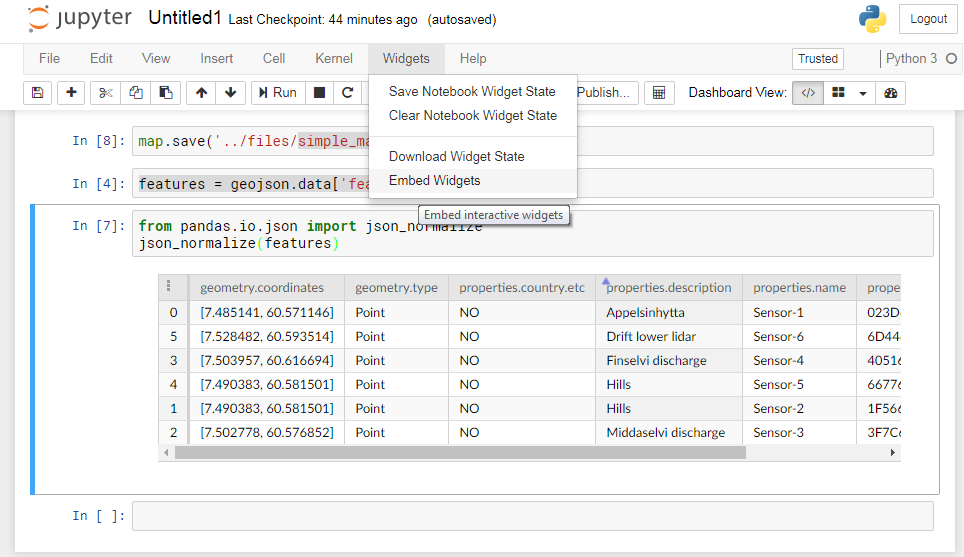
Embedding Widgets in HTML Web Pages
The notebook interface provides a context menu for generating an HTML snippet that can be embedded into any static web page (Click on “Embed Widgets”):
Customize your interactive maps
We added all the station locations on our interactive map but it would be nice to add labels (using available information such as name of the sensor, description, etc.):
features = geojson.data['features']
for i in range(0,len(features)):
    # Add information at the station location when you click on it
    location=[features[i]['geometry']['coordinates'][1],features[i]['geometry']['coordinates'][0]]
    name = features[i]['properties']['name']
    opr = features[i]['properties']['waspmote_id']
    description = features[i]['properties']['description']
    country = features[i]['properties']['country.etc']
    html = """
    <p>
      <h4>name:        """ + name + """</h4>
      <h4>description: """ + description + """</h4>
      <h4>country.etc: """ + country + """</h4>
      <h4>wapsmote_id: """ + opr + """</h4>
    </p>
    """

    iframe = folium.IFrame(html=html, width=300, height=150)
    popup = folium.Popup(iframe, max_width=2650)
    folium.Marker(location, popup=popup,  icon=folium.Icon(color='green',  icon='ok-sign')).add_to(map)

map
Save your interactive map
You can save your map for instance as an HTML file:
map.save('map_finse.html')Open the resulting file in your browser and check you have exactly the same map as in your jupyter notebook
Customize your icons
You can change the default icon, its color, etc.
?folium.IconIf you wish to customize even more your icons (for instance define new icons), have a look at this example.
More documentation on folium python package can be found here.
Create interactive timeseries (2D-plot)
Laura wish to plot timeseries for different variables (such as temperature, wind speed) for a given Weather Station.
Let’s for instance retrieve sonic temperature (by convention sensor=ds2_temp) from Hills (‘Sensor-5’) from the 1st of December 2017 to the 1st of January 2018. We first create a request to remotely access data for download:
import requests
URL = 'http://hycamp.org/wsn/api/query/'
token = 'dcff0c629050b5492362ec28173fa3e051648cb1'
headers = {'Authorization': 'Token %s' % token}

sensor = 'ds2_temp'

# Finse station 'Hills'
station = 'Hills'
waspmote_id='023D67057C105474'
waspmote_id='667767057C10548E'
station_id = int(waspmote_id,16)
start_date='2017-12-01T00:00:00+00:00'
end_date='2018-01-01T00:00:00+00:00'
params  = {
            'limit': 100000,
            'offset': 0,
            'mote': station_id,
            'xbee': None,
            'sensor': sensor,
            'tst__gte': start_date,
            'tst__lte': end_date,
            }
params
Then we request data and plot:
import plotly.offline as py
import plotly.graph_objs as go

# To initialize plotly for notebook usage
py.init_notebook_mode()

r = requests.get(URL, headers=headers, params = params)
if r.status_code == 200:
    if r.json()['count'] > 0:
        data = r.json()['results']
        FinseStations = json_normalize(data)
        # Add a new column where we convert 'epoch' (s) to a datetime
        FinseStations['timestamp'] = pd.to_datetime(FinseStations.epoch, unit='s')
        data_to_plot = [go.Scatter(x=FinseStations.timestamp, y=FinseStations.value)]
        py.iplot(data_to_plot)
To add a legend, title to your plot:
# To add a title, etc.
layout = go.Layout(
    title='Sonic Temperature from Finse Station '+station,
    xaxis=dict(
        title='Date',
        titlefont=dict(
            size=18,
            color='#7f7f7f'
        )
    ),
    yaxis=dict(
        title='Sonic temperature (degrees Celcius)',
        titlefont=dict(
            size=18,
            color='#7f7f7f'
        )
    )
)
fig = go.Figure(data=data_to_plot, layout=layout)
py.iplot(fig)
Test it yourself
Your 2D plot can be customized for instance:
- Try to change the type of markers and/or line (mode=’lines’, mode=’markers’ or mode=’lines+markers’)
- Choose different colors (color name, hsl colors or RGB) by passing a marker argument to Scatter such as marker = dict(size=10,color=’red’)
- Show axes as you move your cursor (add hovermode= “closest” to the layout and showspikes = True and spikesides = True to xaxis or/and yaxis)
solution
# To add a title, etc.
layout = go.Layout(
    title='Sonic Temperature from Finse Station Hills',
    hovermode= "closest",
    xaxis=dict(
        title='Date',
        titlefont=dict(
            size=18,
            color='#7f7f7f'
        ),
        showspikes = True,
        spikesides = True,
    ),
    yaxis=dict(
        title='Sonic temperature (degrees Celcius)',
        titlefont=dict(
            size=18,
            color='#7f7f7f'
        ),
        showspikes = True,
        spikesides = True,
    )
)
fig = go.Figure(data=data_to_plot, layout=layout)
py.iplot(fig)
More information on what you can freely download from https://data.met.no, look at the documentation online.
Arrange your plots in your jupyter dashboard
Choose what to display and how
Go to the
dashboard viewand arrange your cells to get your final dashboard:
- You may add more widgets (
radiobuttons, etc.)- You may hide/show cells
- You may add text cells (HTML or markdown)
If you need any help, use your red sticky note and once you are satisfied, put your green sticky note.
Finally don’t forget to save your jupyter dashboard (dashboard_finse.ipynb).
references
-
Lehning, Michael & Bartelt, Perry & Brown, Bob & Russi, Tom & Stöckli, Urs & Zimmerli, Martin. (1999). SNOWPACK model calculations for avalanche warning based upon a network of weather and snow stations. Cold Regions Science and Technology. 30. 145-157. 10.1016/S0165-232X(99)00022-1. ↩
-
Stoessel, F., Manes, C., Guala, M., Fierz, C., Lehning, M., Micrometeorological and morphological observations of surface hoar dynamics on a mountain snow covers, 2009, Water Resour. Res., doi:10.1029/2009WR008198. ↩
-
Hirashima, H., Yamaguchi, S., Sato, A., Lehning, M., Numerical modeling of liquid water movement through layered snow based on new measurements of the water retention curve, 2010, Cold Reg. Sci. Technol., 64/2, 94-103, doi: 10.1016/j.coldregions.2010.09.003. ↩
Key Points
Take a concrete example and illustrate how to use jupyter dashboards and widgets