Produces figures/main_result.png, the verdict figure: does this
replication reproduce the number the original claims? It puts our series
beside the trend the original reports, and compares the three headline
statistics directly.
This is not the Figure 2 replica
Two different jobs, deliberately kept apart:
| Notebook | Figure | Question it answers |
|---|---|---|
| 04 (here) | main_result.png | Did the number replicate? Ours against the original’s reported values. |
| 07 | figure2_replica.png | Does it look like the paper’s Fig. 2? Same axes, same colours, both curves, ENSO shading. |
| 08 | figure3_replica.png | The same, for the paper’s Fig. 3. |
A comparison figure and a replica are answering different questions, and one cannot do both: this one shows a line the paper does not plot (the original’s stated 25→55 trend) so the two can be judged against each other, while the replica shows only what the paper shows so the two can be laid side by side.
For the ENSO-removed series — the red line of the original Figure 2 — see notebook 07. It is reproduced there in full.
import json
import os
from pathlib import Path

import matplotlib.pyplot as plt
import numpy as np
import xarray as xr
from scipy import stats

plt.style.use("seaborn-v0_8-whitegrid")
TARGET_RES_DEG = float(os.environ.get("MHW_TARGET_RES_DEG", 1.0))
LON_BAND_STRIDE = int(os.environ.get("MHW_LON_BAND_STRIDE", 8))
PERIOD_END = os.environ.get("MHW_PERIOD_END", "2016-12-31")
RESULTS_DIR = Path("../results")
FIG_DIR = Path("../figures")
FIG_DIR.mkdir(parents=True, exist_ok=True)
# The configuration the replication's reported result was produced with: full
# global coverage at 1°, over Oliver et al.'s complete satellite record.
# CI runs the same code over a coarse grid to prove it still works, and any
# other configuration is a partial run whose numbers are NOT the result. Such a
# run must never overwrite figures/main_result.png or be mistakable for it, so
# it is written under a self-describing name and stamped on the face.
FULL_CONFIG = (1.0, 1, "2016-12-31")
IS_FULL_REPLICATION = (TARGET_RES_DEG, LON_BAND_STRIDE, PERIOD_END) == FULL_CONFIG
FIG_PATH = FIG_DIR / (
"main_result.png" if IS_FULL_REPLICATION
else f"partial_run_{TARGET_RES_DEG:g}deg_stride{LON_BAND_STRIDE}.png"
)
if not IS_FULL_REPLICATION:
print(
f"NOT the full replication configuration "
f"({TARGET_RES_DEG:g}° grid, stride {LON_BAND_STRIDE}, to {PERIOD_END}; "
f"full = 1° / stride 1 / to 2016-12-31).\n"
f"These numbers do not reproduce the paper's statistic. "
f"Writing {FIG_PATH.name} instead of main_result.png."
)
_tag = f"partial_run_{TARGET_RES_DEG:g}deg_stride{LON_BAND_STRIDE}"
ANNUAL_PATH = RESULTS_DIR / (
f"mhw_annual_{TARGET_RES_DEG:g}deg.nc" if IS_FULL_REPLICATION
else f"{_tag}_annual.nc"
)
CMP_PATH = RESULTS_DIR / (
"headline_comparison.json" if IS_FULL_REPLICATION
else f"{_tag}_comparison.json"
)
res = xr.open_dataset(ANNUAL_PATH)
with open(CMP_PATH) as f:
cmp = json.load(f)
years = res.year.values
days = res["global_mhw_days"].valuesThe verdict: our series against the original’s reported trend
fig, (ax, ax2) = plt.subplots(
    1, 2, figsize=(13, 5), gridspec_kw={"width_ratios": [1.7, 1]}
)

# --- Panel A: the Figure 2 analogue -----------------------------------------
ax.plot(years, days, color="black", lw=1.8, label="ESA SST_cci + XMHW (this work)")

ok = np.isfinite(days)
slope, intercept, lo, hi = stats.theilslopes(days[ok], years[ok].astype(float), 0.95)
ax.plot(years, intercept + slope * years, color="crimson", lw=1.6, ls="--",
        label=f"Theil–Sen trend ({slope * 10:+.1f} days/decade)")

# Oliver et al.'s stated satellite-era endpoints, for reference.
o_base = cmp["mhw_days"]["original_baseline_1980s"]
o_end = o_base + cmp["mhw_days"]["original_change_over_record"]
ax.plot([years[0], years[-1]], [o_base, o_end], color="tab:blue", lw=1.6, ls=":",
        label=f"Oliver et al. 2018 (~{o_base:.0f} → ~{o_end:.0f} days)")

ax.set_xlabel("Year")
ax.set_ylabel("Annual MHW days (global mean)")
# Not "replication of Fig. 2" — notebook 07 holds that. This panel compares
# our series against the trend the original reports, which is a different claim.
ax.set_title("Total marine heatwave days globally\n"
             "this replication vs the trend reported by Oliver et al. (2018)",
             fontsize=11)
ax.legend(fontsize=8, loc="upper left")

# --- Panel B: headline statistics, original vs replication -------------------
metrics = [
    ("MHW days\nover record", cmp["mhw_days"]["original_change_over_record"],
     cmp["mhw_days"]["replication_change_over_record"], "days"),
    ("Frequency\ntrend", cmp["mhw_frequency"]["original_trend_per_decade"],
     cmp["mhw_frequency"]["replication_trend_per_decade"], "events/decade"),
    ("Duration\ntrend", cmp["mhw_duration"]["original_trend_per_decade"],
     cmp["mhw_duration"]["replication_trend_per_decade"], "days/decade"),
]
y = np.arange(len(metrics))
h = 0.36
ax2.barh(y - h / 2, [m[1] for m in metrics], height=h,
         color="tab:blue", alpha=0.85, label="Oliver et al. 2018")
ax2.barh(y + h / 2, [m[2] for m in metrics], height=h,
         color="black", alpha=0.85, label="This replication")
for i, (_, orig, repl, unit) in enumerate(metrics):
    ax2.text(max(orig, repl) * 1.03, i - h / 2, f"{orig:g}", va="center", fontsize=8)
    ax2.text(max(orig, repl) * 1.03, i + h / 2, f"{repl:g}", va="center", fontsize=8)
ax2.set_yticks(y)
ax2.set_yticklabels([m[0] for m in metrics], fontsize=9)
ax2.invert_yaxis()
ax2.set_xlabel("Value (units differ per row — see labels)")
ax2.set_title("Headline statistics: original vs replication", fontsize=11)
ax2.legend(fontsize=8, loc="lower right")

# Provenance comes from the comparison JSON that 03 wrote, never from literals
# here. This footer used to hardcode "XMHW (DOI 10.5281/zenodo.7662469)", which
# is version 0.9.2's DOI, while the pipeline runs 1.0.0 — so the headline figure
# asserted it was produced by software the replication never used. Naming the
# version and the SWHID keeps the figure honest even when separated from the
# repo, which is exactly what happens to figures.
prov = cmp["replication"]
n_cells = prov["n_cells"]
sw = f"XMHW {prov.get('software_version', '?')}"
swhid = prov.get("software_swhid", "")
sw_rev = swhid.split(";")[0].replace("swh:1:rev:", "")[:12] if swhid else ""
fig.suptitle("", y=0.99)
fig.text(0.01, 0.01,
         f"ESA SST CCI Analysis v3.0 (DOI {prov['dataset_doi']}) · "
         f"{sw}{f' ({sw_rev})' if sw_rev else ''} · {TARGET_RES_DEG:g}° grid, "
         f"{n_cells} ocean cells · climatology "
         f"{prov['climatology_period'][0]}–{prov['climatology_period'][1]}",
         fontsize=7, color="0.35")

# A partial run's figure is visually indistinguishable from the real one, and
# a figure outlives the shell that made it. Stamp it so it cannot be quoted by
# mistake.
if not IS_FULL_REPLICATION:
    fig.text(
        0.5, 0.5,
        f"SMOKE RUN — NOT THE REPLICATION RESULT\n"
        f"{TARGET_RES_DEG:g}° grid, every {LON_BAND_STRIDE}th longitude band",
        ha="center", va="center", fontsize=20, color="crimson",
        alpha=0.28, rotation=24, weight="bold", zorder=10,
    )

fig.tight_layout(rect=[0, 0.03, 1, 1])
fig.savefig(FIG_PATH, dpi=150, bbox_inches="tight")
plt.show()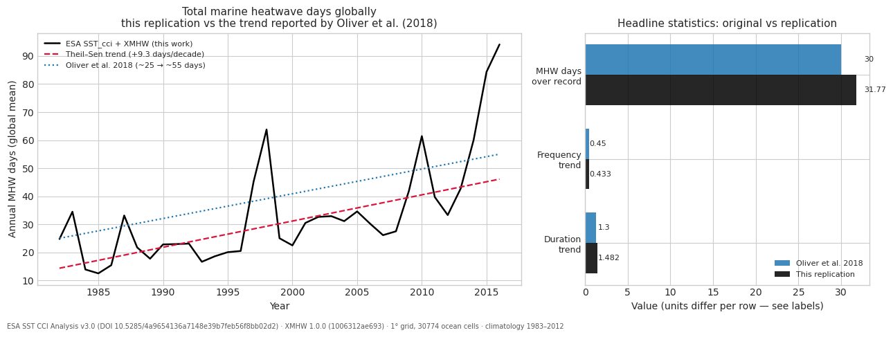
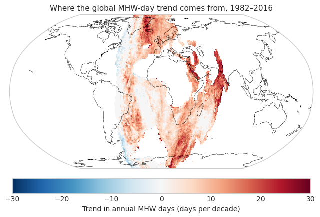
Spatial diagnostic
Not in the original Figure 2, but it shows where the global trend comes from and makes a hemispheric artefact immediately visible if one exists.
try:
    import cartopy.crs as ccrs

    trend = xr.apply_ufunc(
        lambda v: stats.theilslopes(v, years.astype(float))[0] * 10
        if np.isfinite(v).sum() > 10 else np.nan,
        res["mhw_days"],
        input_core_dims=[["year"]],
        vectorize=True,
        output_dtypes=[float],
    )

    fig2 = plt.figure(figsize=(11, 5))
    axm = plt.axes(projection=ccrs.Robinson())
    p = trend.plot(
        ax=axm, transform=ccrs.PlateCarree(), cmap="RdBu_r",
        vmin=-30, vmax=30, add_colorbar=False,
    )
    axm.coastlines(linewidth=0.4)
    axm.set_global()
    cb = fig2.colorbar(p, ax=axm, orientation="horizontal", pad=0.05, shrink=0.7)
    cb.set_label("Trend in annual MHW days (days per decade)")
    axm.set_title("Where the global MHW-day trend comes from, 1982–2016", fontsize=11)
    fig2.savefig(FIG_DIR / "mhw_days_trend_map.png", dpi=150, bbox_inches="tight")
    plt.show()
except Exception as exc:  # cartopy is optional for the headline result
    print(f"skipped map: {exc}")